HYBRID. Unknown identities
Iris Andraschek, Sarah Bogner, Max Landegren, Alban Muja, Markus Hofer/Roman Pfeffer, Andrea van der Straeten, Rini Tandon, Josef Zekoff
The father of genetics, Gregor Mendel (1822-1884), described organisms as hybrid if their parents were of different species. This is neither a characteristic to be acquired by the carrier itself, nor a specific external quality. Rather, the term focuses on the origin, the heritage of a hidden constitution. What Mendel called a hybrid is today understood as the motor of evolution and is as old as life itself. While modernity longed for the “pure”, “hybrid” has become the current key term for numerous phenomena of an increasingly complex world. Selected works by nine artists from Austria, Sweden and Kosovo show what hybridity can do to the attitude to life. In free correspondence with the three thematic fields hybrid nature, hybrid minds and hybrid bodies, they use various media to address the problem of insoluble ambiguity, ranging from questions of evolution to discourses on identity projections in societies in the process of transformation.
ROOM 1
[Hybrid Nature]
“Everything that mixes always takes place on borders.”
Renée Schröder in conversation with Iris Andraschek
For a long time, Iris Andraschek (* 1963 Horn) has been mentoring people who have developed a particularly intense relationship with nature in very different ways. In the run-up to hybrid talks (2020), the artist has sought dialogue with various experts from the field of plant biology and asked them about their assessment of natural and artificial hybrid formation. These include the breeder and biologist Reinhild Frech-Emmelmann, managing director of a company in St Leonard producing hybrid-free, true-breed seeds; Associate Professor Michael Kiehn, a plant biologist and director of the Vienna botanical gardens; Associate Professor Renée Schröder, a cell biologist working at the Institute of Biochemistry at the Max F. Perutz Laboratories, Vienna; Associate Professor Walter Till, Department of Botany and Biodiversity Research at the University of Vienna; and Dr.rer. nat., Mag.rer.nat. Helmut Zwander, a botanist and university lecturer in Klagenfurt.
At the latest since Documenta 12 (2007), at which Ines Doujak’s provocative Siegesgärten were shown, a sharpened awareness of the problems of the current seed industry has developed in the art public and beyond. In a direct yet one-sided way the subject of hybridity was also touched upon at the time: if farmers originally extracted seeds from their own harvest, this natural and autonomous cycle was interrupted in the 1970s. Since then, monopolised hybrid varieties have dominated and globalised the market. They inevitably lead to dependence on large seed producers, because hybrid seeds cannot be reliably propagated. The politicising work of Ines Doujak has therefore focused on seed patenting as a continuation of colonial exploitation. The thoughtful and poetic work of Iris Andraschek, on the other hand, is about a more global view of hybridisation that cannot be appropriated and which also takes account of the aspect of a kind of “creativity of nature”, without which evolution would not be possible.
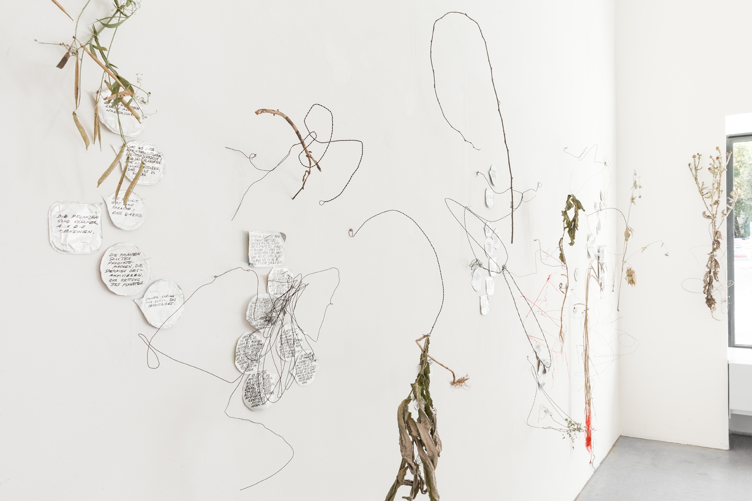
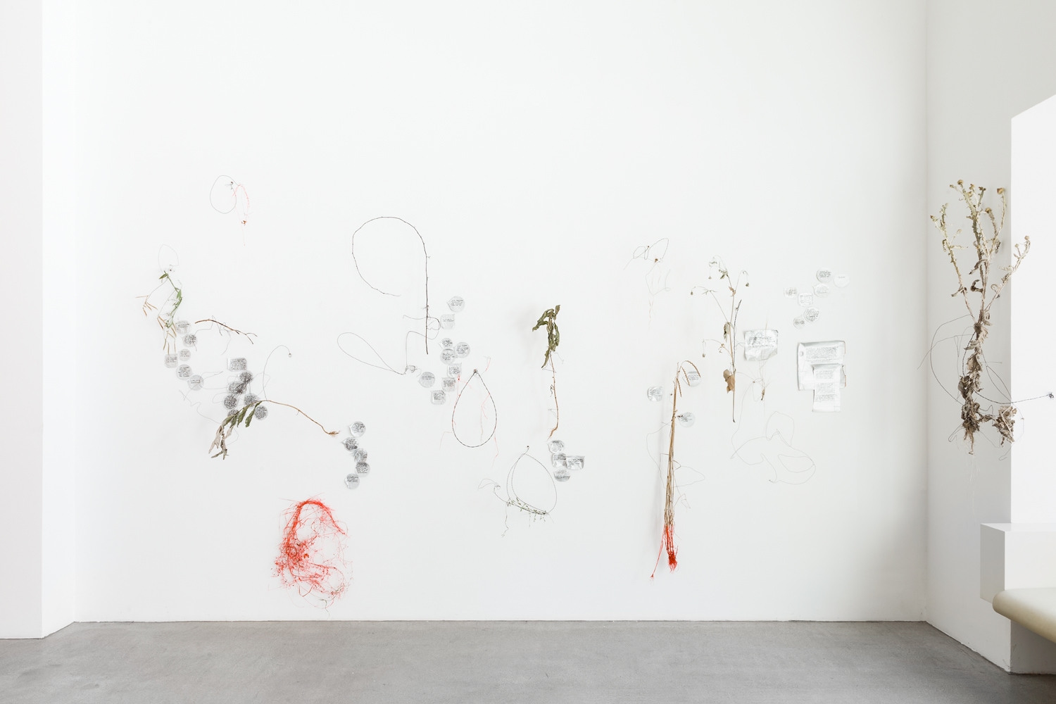
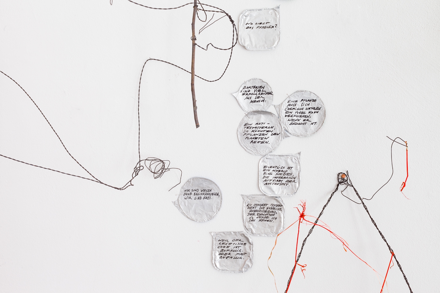
Let’s take a closer look at the work hybrid talks: Threads that in their intricacy evoke associations with the life threads of DNA and simultaneously correspond to the rampant forms of unchecked vegetable growth, these threads contain grasses and other plants that do not belong to the ornamental plants but seem to have originated from a natural pollination. Some are completely uprooted, others bear clear traces of a ruthlessly intervening civilisation, such as the bright signal colour used to mark trees. Largely yellowed, the withered ones show an unstoppable decay. Their lifespan is short. Only a few weeks ago they were part of the flowering of this vegetation period. It is this peculiar movement of decomposing organic matter, the special grace of wilting plant forms, the long moments of a memento mori, which make us aware of the fragility and cyclicity of creation. Shiny aluminium covers shimmer alongside the dead plant husks. They too are discarded and come from containers that belong to civilisation’s waste, whose decay, unlike that of plants, will take many years. Iris Andraschek has recorded her discussion partners’ statements on these thin foils. Like speech bubbles of a lively and polyphonic conversation, they float between the plant forms. Statements about a natural hybrid formation stand next to those about an artificial one, and even more so: Iris Andraschek particularly brings up sentences that cast critical perspectives on socio-political issues. Hybrid talks transforms the gallery into an ephemeral arena for exciting discussions. Through her artistic practice, the artist invites us to participate in the important discourses. One thing becomes clear: life without the formation of hybrids is inconceivable. But why has this topic become so important to us today?
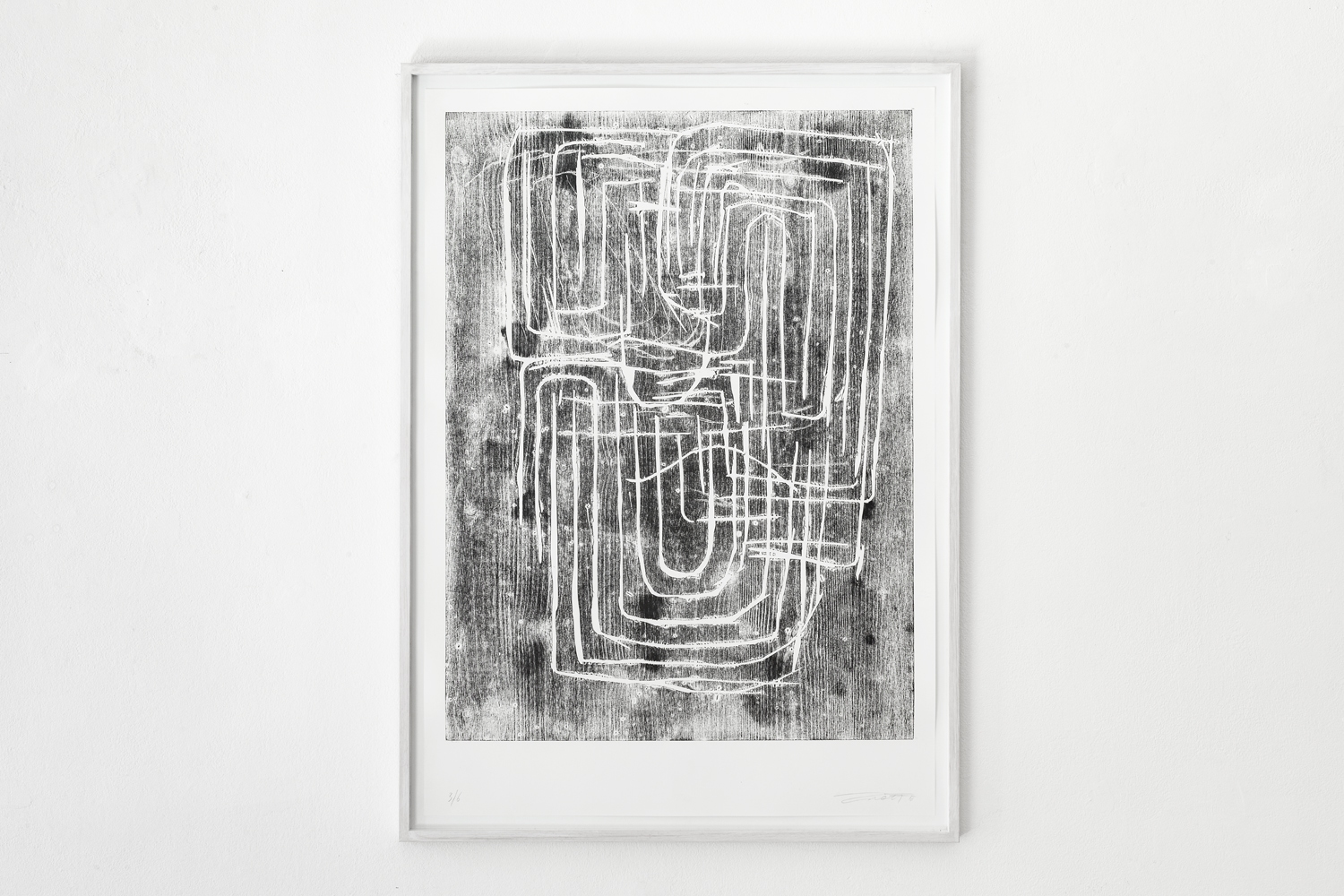
New Alexandria by Josef Zekoff (*1977 Vienna) provides an enigmatic counterpoint to hybrid talks. It is a large-format woodcut from the series eight new cities (2016). The artist has taken the risk of the letterpress process in a special way and lets the grain of the spruce-wood printing plate speak for itself: it leaves the authentic imprint of an unknown tree’s biography. Knotholes, drops of resin and dense annual rings indicate vegetation periods in barren surroundings. Lighter and darker fields, which result from different ink adhesion, ultimately allow a cosmos-like primordial ground to develop from the printed surface. An enigmatic linear structure stands out brightly in front of it: the artist has used various engraving tools to carve a geometric figuration out of the wood. One could describe it as an interlocking of three rectangular labyrinths. The entrance and exit seem to be on the left, there is no way through. What spreads out before our eyes is rather a network of paths with many hairpin bends and turns, with dead ends and closed loops, a synonym for complexity. Alexandria, built by Alexander the Great in 331 BC as a planned city, was home to the most important library in the ancient world. Can the New Alexandria woodcut be read as the capital of our hybrid lifestyle?
[Hybrid Minds]
It seems that many of the works by Rini Tandon (* 1956 Raipur) revolve around the existential parameters of a life at the intersection of different worlds of experience. In 1978 she decided to continue her art studies, which she had begun in Delhi, in Vienna. Today she teaches and works in this city without ever having given up her relationship with India. “I grew up in a post-colonial, hybrid world and have never stopped adopting new forms of hybridisation”, the artist says about herself. She is intensely concerned with the interlocking of different modes of perception, whether it is the spheres of seeing and knowing, of observing and remembering, of distance and participation. What if these spheres cannot be harmonised? Highly individualistic, poetic pictorial inventions are the answer. Depending on the subject matter, she resorts to various media and materials. We search in vain for personal gestures or a fixable message. Rather, Rini Tandon questions these possibilities: “How can thoughts, theories, knowledge, sensations, concerns be transformed into a statement so that their realisation gives rise to an object, a drawing or a strand of images?” There is no ostensible narration, no linear development, no end point in her erratic works. The key to understanding is provided by reflections in which the artist, as creator, obscures herself: “If material has the qualities to guide a particular process, then space is the condition that inscribes the intention that the material will assume.” (RT 1989) In the subjunctive of possible conditions, space and matter appear as opponents of an undecided cosmic process that could lead to the concretisation of a form. One of her central themes is clearly expressed here – the continuum of space and time. Explorations of these phenomena have been negotiated in art discourse fields since the 1960s. In 1979, Sculpture in the Expanded Field, the influential article by Rosalind Krauss, was published. On the subject of processual Gestalt formation, Krauss sensitised people to the phenomena of temporality. Rini Tandon reacted in her own way: I Sculpt in Time (see notes around 1998) she confesses, and in this understanding she interweaves various media forms of expression. The works presented here show that it is also always a matter of sounding out the perception of certain and indeterminate, defined and indefinable spaces.
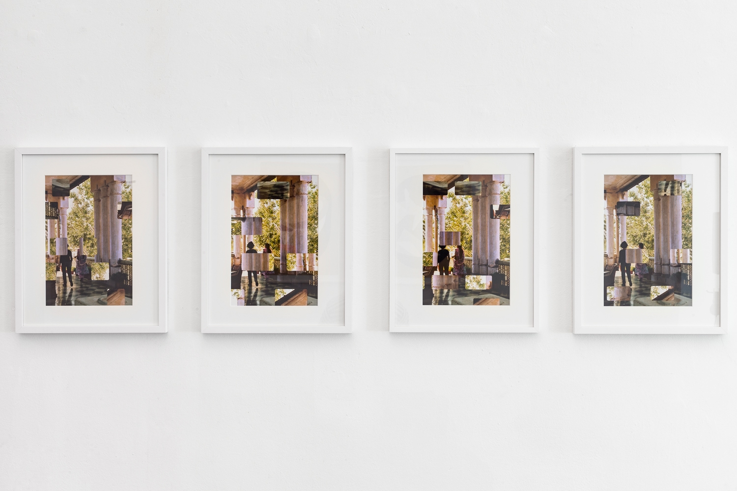
A stately terrace spreads out in the field of vision of the four-part photographic work The Pillars of Ajmer (2004). Mighty columns support a stone roof. The floor and a filigree balustrade are also made of stone. Coolness seems to rise. The view from the shady in-between realm leads into a tree-covered natural world. Leaves whirl in the wind, glistening light makes the sky seem white. Near the house we see two women. They cross the terrace to leave. Backlit, their steps cast long shadows. One of the women hurries ahead, she is wearing an Indian robe, the other is dressed in western clothes. It is the artist herself and it is her ancestors’ estate on which she is turning her back here: a thought-provoking passage. The Pillars of Ajmer is one of the first works in the Ocular Series (2004 –). In these works Rini Tandon reflects on knowledge about the processing of senses in the visual cortex. It is only by turning and reversing from above and below that the brain creates the image we seem to see. Accordingly, the artist has perforated four prints of analogue photographs at different points with the outline of a film frame; with the sides flipped and upside down, details of this photograph are inserted into these cut-out fields of vision: the viewer has to perform a “somersault of perception” (Rini Tandon). Through the act of identifying the fields of vision, adjusting them in the picture and at the same time supplementing what is concealed, viewers are encouraged to appropriate the picture in their own way. The visual withdrawal is at the service of increasing visual perception, enlivening and individualising it, but also to disturb and distance the experience of an illusion. In the end, four different views of a farewell emerge. The span of one step experiences a multifaceted temporalisation.
In Window I (Light Catchers) and Window II (Light Catchers) (2000-2019), the viewer is stimulated to similar visual work in a very different way. The counterparts belong to the series of Chromolux works, the beginnings of which date back to the 1980s. At that time Rini Tandon began to use prefabricated material. Fascinated by the effect of glossy colour surfaces and their potential to disguise an underlying material body to the point of negation, she discovered Chromolux papers. In the two new works she has collaged glossy black Chromolux surfaces in the form of an oval on non-reflecting wrapping paper. These surfaces could be windows, as the title suggests, but the spatial conditions remain unclear. What is presented to the eye in this oval are more colour forms. As we learn from Rini Tandon, these are negative forms of Chromolux paper used differently. They touch and overlap, chains form. Two surfaces repeatedly come together in such a way that perspective expectations are awakened but never completely fulfilled. Rini Tandon combines elements that remain foreign to each other, that cannot be made to cohere in any way. Nor is there any overlap with the edge of the black oval, so that the impression of a window opening with a contingency spreading out behind it must finally be abandoned. The collage remains what it is, an encounter with coloured surfaces. It leads to a constellation that has never been seen before.
Rini Tandon’s films are also about non-coherent spaces that nevertheless flow into one another. In the early 2000s the artist began to record situations and encounters using a large, hand-held Sony video camera: “The causes and energies in my video constellations arise entirely from my own experienced, felt sensitivity. They are triggered by the absolute need to use images to express something.” (RT 2020). The first video was consequently entitled Streams Between – Traversing Trajectories (2003). The reworked film sequences were as complex as the recordings were unconditional. She herself describes her films as experimental essays. Similar to a “visual subtext”, at the same time she always shows how the digital medium is generated through the unity of pixels. Furthermore, by shifting and dislocating sound, rhythm, atmospheric noises, mere pixel value and finally the illustrating image, perception forces its way into consciousness via the complex events of perception itself.
Blue Window (2007) and Darkness (2010) were shot in India. Possibly moved by an outside source, the camera eye seems to have no solid ground beneath it in either film. What remains open is how it relates to the hostile world it captures. The excerpts do not allow for an orienting distance or overview; human bodies are only seen in fragments. Both films are reduced to a few colours; there is no speech. The searching gaze is confronted partly by artificial-technoid, partly by atmospheric sounds (wind, train, helicopter, dogs barking), in which proximity or distance are alternately expressed; the passing of time enters consciousness through the countable, and other spaces repeatedly seem to open through the acoustics. Asked about her intention in Blue Window (2007), Rini Tandon answers that she is concerned with the: “state of continuous movement, a quivering, moving ground – which cannot be stopped. The motionless feet are related to a moving body in space, to a moving cabin, to the moving images out of the window, to what is called stillness in motion. The visualised interlocking of space-time is related to an experienced space-time dimension. It shows a journey with many parallels, but without stations, without a terminus. The racing red dot at the window moves like a punctuation mark, like a ray of light – a reminder of matter that in this moment here should remain indecipherable.” In Darkness (2010) the images are accompanied by text excerpts from George Spencer Brown’s Existence Is a Selective Blindness. The film begins without images and opens with an existentialist statement: “A thing is defined by its complement, i.e. by what it is not. And its complement is defined by its uncomplement, i.e. by the thing itself . . .”, only to question this statement in an irritating way with a wandering glance into a dubious scene: then, what is Darkness in the discrete light of presence?
With the video installation Family Album Alban Muja (*1980 Mitrovica) caused an international echo at the last Venice Biennale. Young people emerged from the darkness of large projection screens in the Kosovar pavilion and quietly told of their experiences during the Kosovo war (1998-1999). Quietly and unagitated, they sat opposite the Biennial visitors as if they were neighbours, while traumatic experiences slipped from their lips and could simultaneously be read in superimposed quotations. The people whom Alban Muja has brought to speak here in long shots are the people behind the media icons of the Kosovo war. This work is about the fundamental discrepancy between what the mass media bring into every house as supposed documentary and the actual experiences, it is about corrupt collective memory, about fake identities, real identities and possibly hybrid identities. When I ask him whether he would like to participate in the exhibition with the theme “Hybrid. Unknown identities”, he answers with his biography: “definitely for a long time it was part of my research, identity and often ‘fake identity’ as I was born a child in Yugoslavia, from an Albanian family, raised under the Serbian Milosevic regime and grew up as an artist under a UN protectorate, later/now Kosovo independence, not necessarily fully independent.”
A whole film series by Alban Muja revolves around identity constructions in spaces that are subject to constant change in political systems. Each of them has a name in its title, and then reveals the story of the person who is listening to it. The assignment of identity takes place in the naming process. For many, it remains a battlefield throughout their lives, in which external determination and self-determination face each other. It is a common fact that positive projections are the inspiration for naming in many cultures. In times of crisis, political hopes are increasingly expressed in this. In some situations only a foreign name guarantees survival. A special film from this series is the 2018 film Forca. It is based on a real chance encounter.
Alban Muja remembers: “in 2017 in Tirana I accidentally met the girl ‘Forca’ (real name Lorena). She knew my works a bit and she said that she had written a thesis about names as phenomena of transition, political, economic and social, because it is her history. After reading her thesis, I invited her to Pristina to do a film with her. … We discussed for a while and then I turned on the camera and did not interrupt her at all … she decided to talk in Italian, because she thought she is better in Italian than in Albanian, and sure I accepted it.” (14.06.2020)
In the first and only scene of the film the young woman sits casually opposite us. The camera shows her from slightly below, next to a potted plant, an orchid. In telling the story she rubs her hands and sometimes swallows deeply. Sometimes her gaze wanders. She begins her story seriously and forcefully with the school day when she is allowed to use her real name for the first time: “Lorena”, [the laurel wreath bearer, the winner]. Behind her lie 15 years of an involuntarily assumed, foreign identity as Forca, which in this spelling means “pitchfork” in Italian. She has suffered greatly from the mockery of the name, which was not her real name. The story is complicated. When Lorena was born in Shkodra, Albania, in September 1991, there was on the one hand the impoverished state of Albania, whose communist government had been overthrown a few months earlier, and, on the other, Kosovo, where the Albanian population had been subjected to severe repression for years. Lorena’s family, which was close to the communist government of Albania, flees for fear of persecution. In the German refugee camp in Mainz she meets another Albanian family in the same family set-up, but which has fled from Kosovo. When their request for asylum was recognised, her family’s request was rejected, the Kosovars hand over their passports. Lorena must now go by the name of Forca. The alternative would endanger her family’s existence. With the “false” Kosovar identity, the family settles in Italy, unaware of how restrictive the status of an asylum seeker and the consequent deprivation of any possibility to travel is. After 15 long years, the family started legal proceedings to reassume their old identities. In contrast to her parents, this is a great gain for Lorena. She can travel, she can study and she can call herself Lorena again.
[Hybrid Bodies]
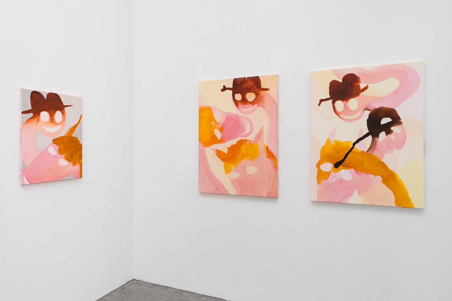
“I love the freedom of absurdity” answers Sarah Bogner (*1980 Munich) when I ask her about her preferred subject of the last few years. Since 2016, the versatile artist has dedicated herself to a series entitled Pink Horses. On paper or on canvas, in small- and large-scale formats, they hang and stand in her studio alongside pink brush bristles, ink bottles, empty eggshells, heavy printing presses and an Amedeo Modigliani postcard. The earlier works show the pink creature in all its potency: a fantastic four-legged animal with three necks. With anarchic vitality the heads protrude recklessly into the surface. Dressage seems unimaginable. Gender is not a question. Dimensions remain unexplained. Surface remains surface. The colour spectrum moves in a sought-after artificiality and shines with the maladjusted flair of modern toy production. All this is reminiscent of comics and anime and – although nameless – the characters of the heads are also as fixed as in the world of comic figures. There is the horse with its indomitable, fuzzy yellowy-orange mane and pointed ears – it likes smoking cigarettes – then the daring cat with a baseball cap and finally the civilised gentleman in a bowler hat. Quite human animals, it seems. But white holes denote the eyes and usually there is an eerie grin on their faces. They are only fictions; they are only masks. In the later works Sarah Bogner narrows the detail. The various character types are captured in individual portraits or shown in lively conversation in twos and threes. In close-up the fetters fall. The common continent of the body goes under. Not only are these fantastic creatures hybrid, so is the artist’s technique. She carefully primes canvas surfaces until a fine-grained adhesive epidermis is created, then she mixes the colours: linseed oil, egg yolk and ink. These are applied in thin, watery layers. Sensations of fluidity take their unpredictable course: osmoses blur, colour clouds swell, crystallisations circumscribe. Sarah Bogner is one of a young generation of artists who have returned to painting – freed from ideologised conflicts between abstract and figurative positions. Freed from conventions, they draw from all conventions.
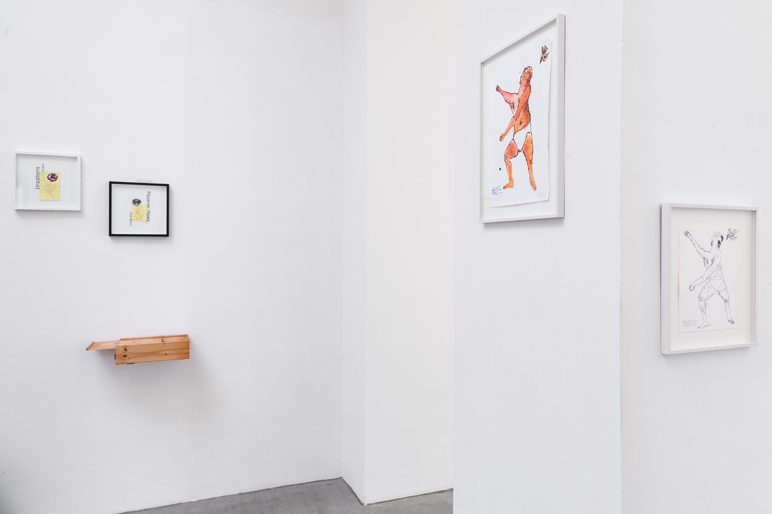
One of them is Josef Zekoff (*1977 Vienna). For some years the painter and draughtsman has been dealing with Greek mythology. In his works, the imagery of the new media meets that of the old myths: apparently naive present-day movement patterns are captured with the linearism of Greek vase painting. In keeping with the exhibition, he has chosen the demigod Hercules, the son of a god and a mortal, who since ancient times has given rise to various pictorial works. “Herculean strength” has remained proverbial to this day and knowledge of his trademarks, a club and lion skin, has not been lost. Prepared by a pencil drawing, Josef Zekoff threw the young Hercules onto the page in a few outlines. Ink blotches enhance the impression of virtuosity. For the incarnate parts he chooses pastel chalks in golden-brown lion tones. In spite of extreme scarcity, the complex subject matter quickly acquires contours, provided today’s media-savvy viewer allows their visual literacy to play.
What they then see is an athletic young man with slightly bent knees and well-trained thighs, firmly anchored in a cheerful, paradisiacal world. Five blue wavy lines suggest a Mediterranean ambience. Intimacy is preserved, nothing is threatening, nowhere is responsibility to be taken, the father of the gods is present. In the shape of a discreet eagle he flutters down from above. Smiling, the carefree son leans his head towards him, while he reaches with both arms in the opposite direction, as if holding on to his club. More than that: as if he was spanning the whole world of myths in between, to which he belongs and to which Josef Zekoff feels so close. This page seems to be about the happiness of human mastery of superhuman nature. In harmony with himself, the demigod child shines. One could speak of hybrid harmony. The pastel drawing clearly bears the year 2020, a statement that is both a testimony to the times and an anticipation of archiving. It is difficult to decide what the artist’s concern is: is it the visualisation of antiquity or the antiquation of the present? Is that still relevant?
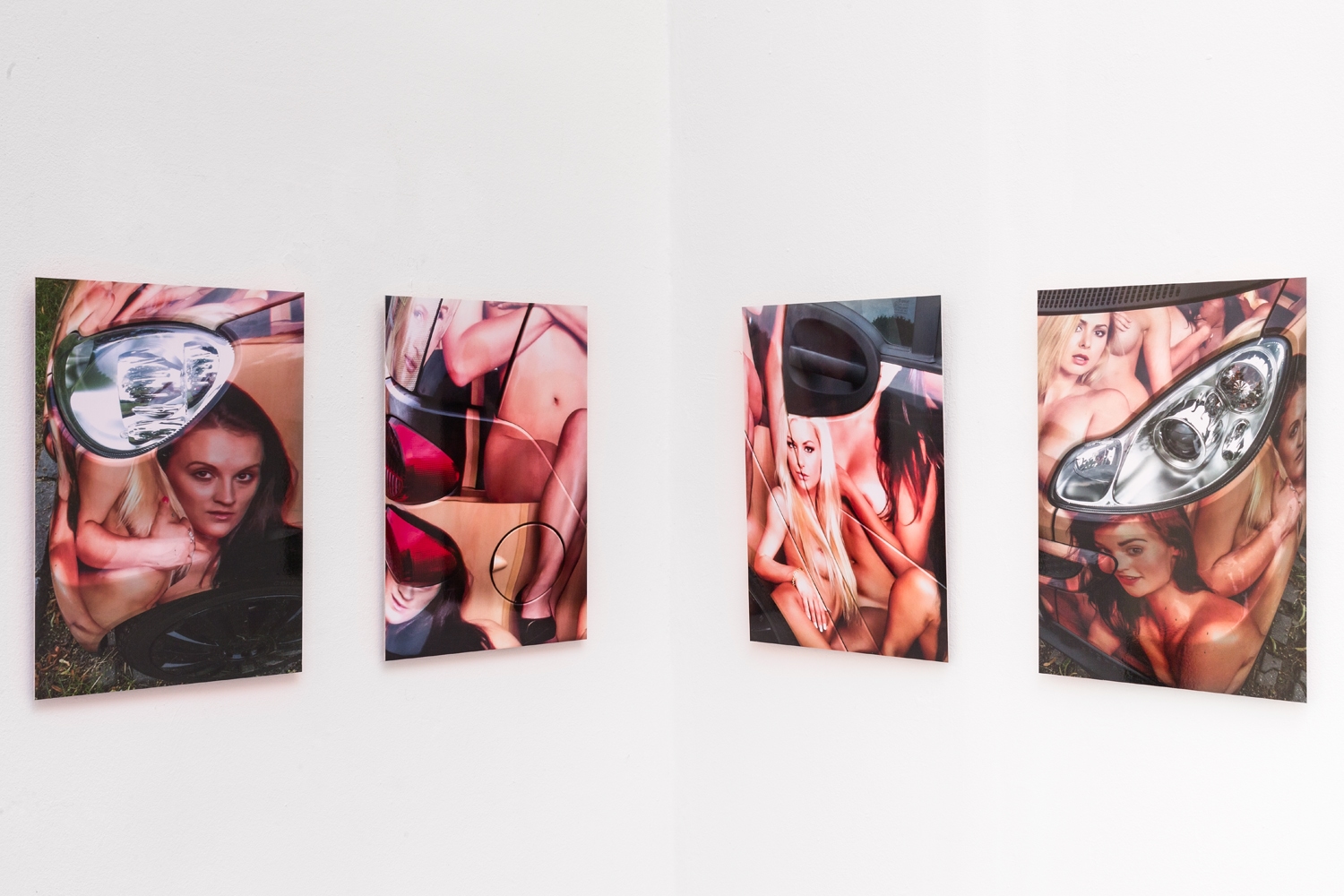
From a different perspective, Iris Andraschek (* 1963 Horn) presents us with a body of iridescent presence. In contrast to Sarah Bogner and Josef Zekoff, she does not draw from fantasy or literature, but from reality: early on she developed a special interest in communities that operate on the margins of “norm societies” and follow alternative life models. In these social spaces, the boundaries between the public and private spheres are often blurred. The artist prefers to process her impressions in the medium of photography and drawing. For the photo series created in 2020, she chose the title Golden Times, a promising name that is more often be found in pertinent establishments of the sex scene. In four close-ups Iris Andraschek focuses on a brothel owner’s car. Its painted outer skin is covered with reproductions of flesh-coloured limbs of long-haired sex workers, one almost wants to say “tattooed”, because the symbiosis between the identity of the driver, his vehicle and the business advertised is obvious. It’s all about naked skin and yet not about nudity: the young women’s arms and legs swell with the streamlined shape of their wearer, mouths smile invitingly, but breasts and private parts remain hidden. Iris Andraschek uses her lens to strip away the illusion: the door remains closed, the view through the window leads into emptiness, the wing mirror reproduces the extremely distorted grey world of the street and the red taillights have gone out. “Golden Times” stands driverless in a car park.
Text, as a medium that takes shape in the process of gradually condensing polyphonic perspectives, could serve as a metaphor for the careful artistic practice of Andrea van der Straeten (* 1953 Trier) and is also her preferred object of investigation. She combines found words and images, visual and linguistic, into highly referential works, and in doing so – not without humour – makes obvious what communication can convey, spoken and unspoken! Alongside photographs and film, her formats include collages, artist books, installations and performances. With this linguistic and media-analytical approach, the conceptual artist stands in a tradition that began in the 1960s. John Baldessari (1931-2020), for example, could be mentioned as an important pioneer.
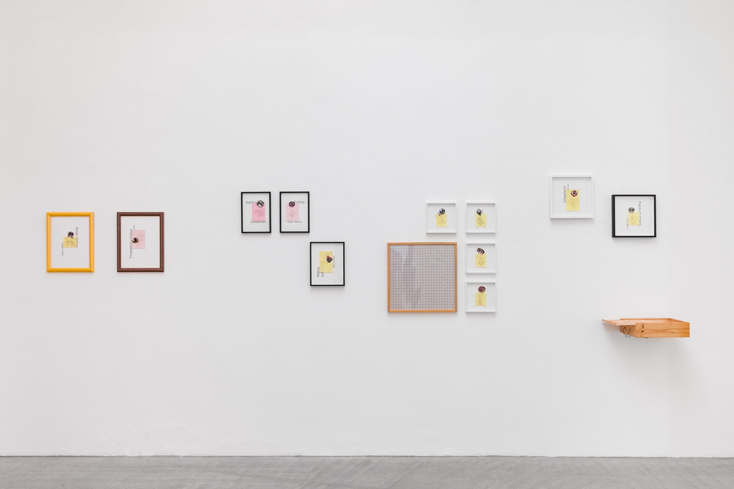
With the thirteen-part series TWINKS (1995-1998/2020), the artist began at a time when in the course of the digital revolution a certain canon for the display of scientific collections was beginning to emerge. Collection holdings were fed into complex information-processing systems, such as image databases, by means of naming, indexing and an apparently objective visualisation, and located for an incalculable period of time.
“The collection holdings” that Andrea van der Straeten draws on from her personal stock in TWINKS are the so-called Wäscheblumen [Lingerie Flowers], a series of photographs that she had already completed in1998. They show intimate underwear such as briefs and nylons, just as she had taken them off at the end of a day. Lying on the floor, they seemed to assume the formation of a flower. It was easy to associate the inside of these flowers with images of recently revealed sexuality. The title TWINKS may be due to this atmospheric image. It refers to the New York gay scene of the 60s. This code word was used to describe shy young men whose sexual characteristics were still very tentatively developed. Andrea van der Straeten cut out these lingerie flowers and assigned them to a certain plant genus – for example dahlias. From a catalogue of plants she then chose names of breeders – such as Bubiköpfchen, Boy O’Boy or Hot Bikini. From scientific textbooks she then drew the outlines of their botanical figure that is typical for the genus on transparent, pink or lemon-yellow carbon-copy paper. Here already the density of the growing complex of interwoven reference systems can be guessed. Andrea van der Straeten does not harmonise them, but rather plays them off against each other subversively. Thus the artist uses typography to stage the amusing contrast between the Latin genus name from botanical systematics and the arbitrary breeder’s name. Almost aphrodisiacally, the latter seems to want to win over the lover of gardens. Furthermore, both inscription systems are obstinate and do not take into account the orientation of the bearer page and the corresponding legibility, some are even covered by the drawing. It is also important to note that not all the collages are recorded with the same consistency in the course of this apparent classification process. For example, some of the “lingerie flowers” were given an outline drawing, but not a name. The artist has stuck one of the nameless ones onto a grid system which, on closer inspection, cannot be assigned to any conventional scale and is itself fragile. This sheet lies in a misused wine box. For the other collages Andrea van der Straeten sought individual framing solutions in different sizes and colours. Fitted with a spacer strip, they take on the depth of narrow hanging display cases. In the end, the viewer is presented with a multifaceted plurality of individual appearances from the plant kingdom. These, however, cannot be clearly assigned to any of the systems Andrea van der Straeten alludes to via typography, botanical systematics, scientific presentation techniques and standard display. Life eludes final classification. The freedom of hybrids is inviolable.
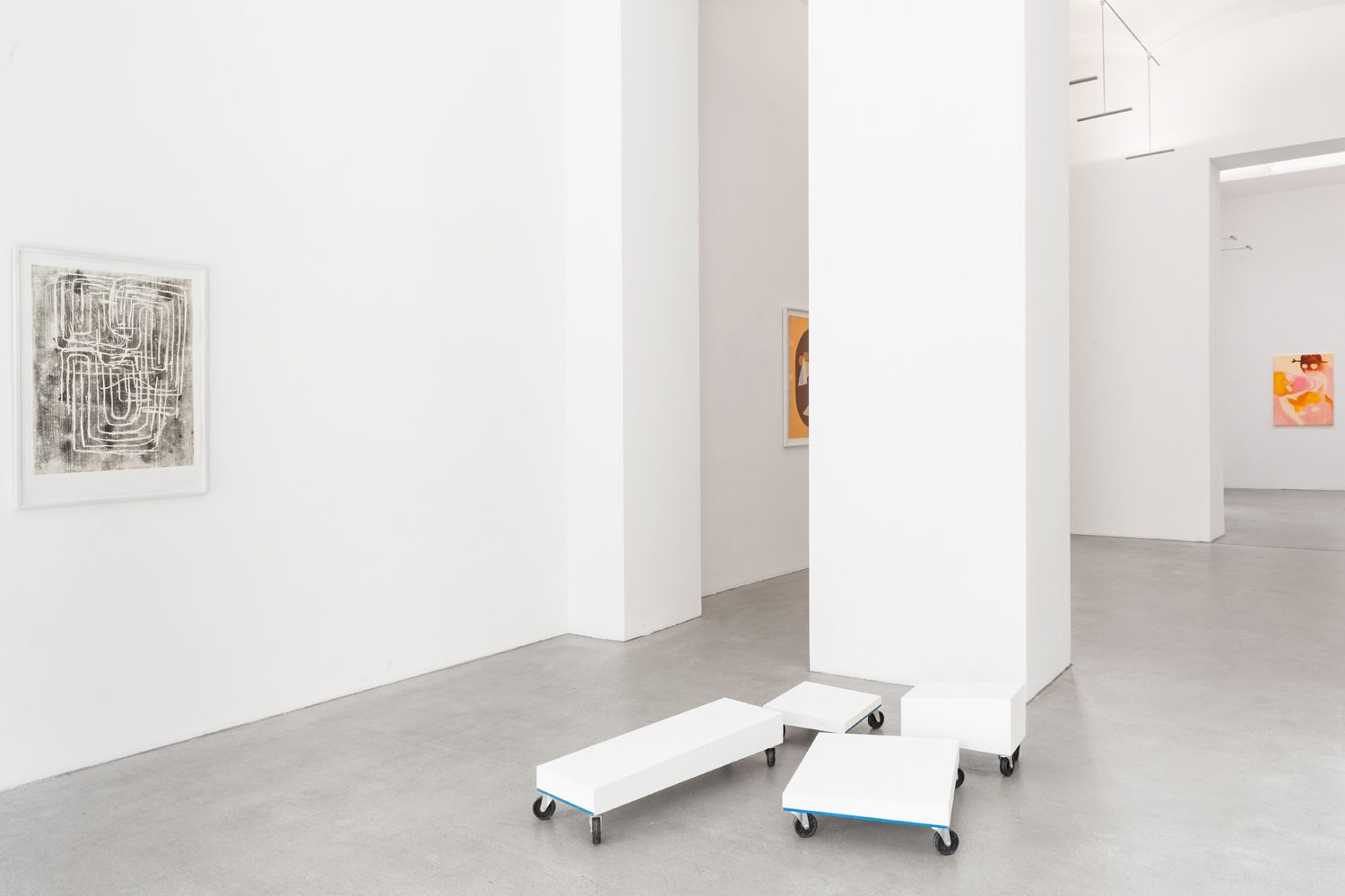
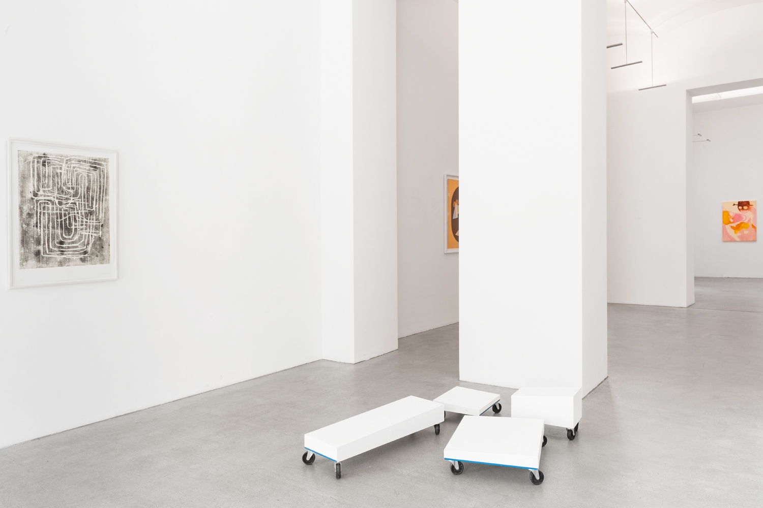
The multi-part work Devices 1 – 4 by Max Landegren (* 1991 Stockholm) also deals with the conditions of the real world. The artist works on the threshold between sculpture in public space and performance. He received his decisive impulses from reading Donald Judd. To this day, Judd’s essay Specific Objects (1965) has lost none of its explosive power. What the American artist called for in this was a concept of art that he described as “the new three-dimensional work”: the transcendence of European art was to be opposed by “specific objects” as a self-referential, material existence. In this way not only was the conventional understanding of genres eroded. Viewers also found themselves in a new, participatory role. Judd’s invective can best be summarised in negation: no narrative, no metaphor, no perspective, no visible authorship, no subordination of the whole to the individual parts, but a confrontational counterpart who occupies the same living space. Donald Judd’s essay was nothing less than a general attack on European rationality with its superordinate systems and hierarchies.
Max Landegren seems to agree in particular with this critique of rationality in his complex work Devices 1 – 4: Four plywood bodies of different dimensions, painted in neutral white, rise up on rectangular floorboards. Four wheels on each give them mobility in all directions. While Landgren adheres strictly to orthogonality in the substructure, their upper surfaces are designed as inclined planes. A closer look reveals that Landgren has drawn a horizontal blue line along two adjacent sides of the base plates. If one pushes all four bodies together to form a square on an area of 90 x 90 cm and thus immobilises the moving parts, this blue line moves horizontally around the entire conglomerate like a red thread. Closed in on itself, the line turns into a graphic indicator or frame for the fact that – at least temporarily – a certain completeness or wholeness has been achieved in this area. Since the surfaces of the individual blocks are at different heights and with different inclinations, they assert themselves in this conglomeration as individual, independent entities. As with Judd, there is no serial sequence that could be continued at will. Rather, the impression of plurality and diversity remains. At best, this constellation could be described as a kind of landscape relief that can easily be surveyed from above, since the highest block measures only 39 cm, which corresponds to average knee height. However, the fact that a fixed counterpart and, even more so, a stable, unambiguous appearance with a clear message is rejected; the fact that the rolling bodies below eye level can penetrate the habitat as potential stumbling blocks is disturbing. Unlike the usual Untitled in Judd, however, the title Devices suggests that the mobile objects are intended to be useful. Have we misunderstood? Are they seating, skateboards or mobile flowerpot coasters? The viewer seeks instructions in vain. Max Landegren, who also studied architecture and is critically engaged in the standardisation of movement patterns through architecture, would approve anything. With the supposed functional appeal of his “specific objects”, which at the same time insist on an ambiguous ambivalence, he takes the direction in which industrially prefabricated everyday design can lead ad absurdum: dressage through design. In Devices 1 – 4, calculated hybridity becomes a strategic system trap!
ROOM 2
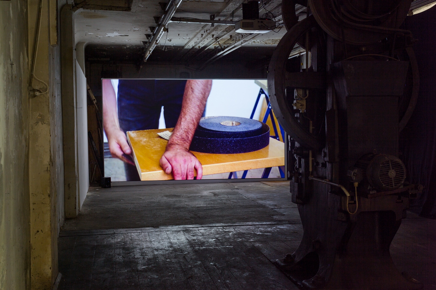
Roman Pfeffer (* 1972 Vöcklabruck) also finds his subject in reality. With archaeological intuition he reaches for the fund of things that have just come to an end. Again and again he comes across objects that do not originate from ordinary household goods, but were conceived with selected precision and in valuable material for a special purpose. On closer inspection – like the one-time bottle dryer – they reveal themselves to be the heart of our civilisation. In the following experimental phases, the artist analyses their construction and composition, dismantled, decomposed, sawn up – without regard for losses. He then playfully tests unfamiliar connections on the material remains and finally reassembles the arsenal of parts in a new order. The two-part work The Restricted Conference (2011/2013) shows how such a process takes place and what can be created in this way. It consists of a video film (camera Viktor Schaider) and a large photographic work (c-print) and has been realised together with Markus Hofer (* 1977 Haslach), an artist who shares Pfeffer’s creative attitude towards found objects. The fact that the current situation of the chronic restriction or even cancellation of meetings gives this work a surprising topicality was not foreseeable. The first scene of the film shows an empty room. A functional conference table spreads out on a worn board floor: lacquered wooden board, two solid metal legs, four outlets for cabling, a button telephone. That’s all, no chairs. In the rear wall, however, there is a row of sockets: what was negotiated at this table should be connectable, should have a wide effect. No doubt, important decisions were made here. Finally, both artists join in, rapidly alternating close-ups accompany their practised movements and cast a spell. Calculations are measured.
As if it were a show trial or a ritualised execution, the destructive work takes its course. Nothing associates this form of dismantling with the blind aggression of the Viennese Actionists Friedrich Achleitner and Gerhard Rühm, who in April 1959 smashed a piano on an open stage with deafening noise. Roman Pfeffer and Markus Hofer are not concerned with vandalism, but with transformation. We watch this act from the distanced proximity of a scientist. Through the camera and without sound, the observer’s status is geared towards a purely visual experience. Sparks of white flame fly as the metal saw starts. Viscous glue dripping from the saw indicates the turning point. In the end the table has indeed disappeared, but there are no broken pieces of debris in front of us. What we see are two identical chairs and the telephone. Only the round openings in their backrests and some unfinished edges betray their genesis in second-hand material and remind us of the simulated paper worlds of a Thomas Demand. The chairs have long ceased to exist. But the artists have captured the pair in a portrait on a large colour print. Smartly facing each other, they stand together in the septic design of a purist room, without a socket, without a telephone, as if they were waiting for Godot or the next transformation.
Heidrun Rosenberg (28.08.2020)